Comm 130 W05

unofficial advertisement add unedited

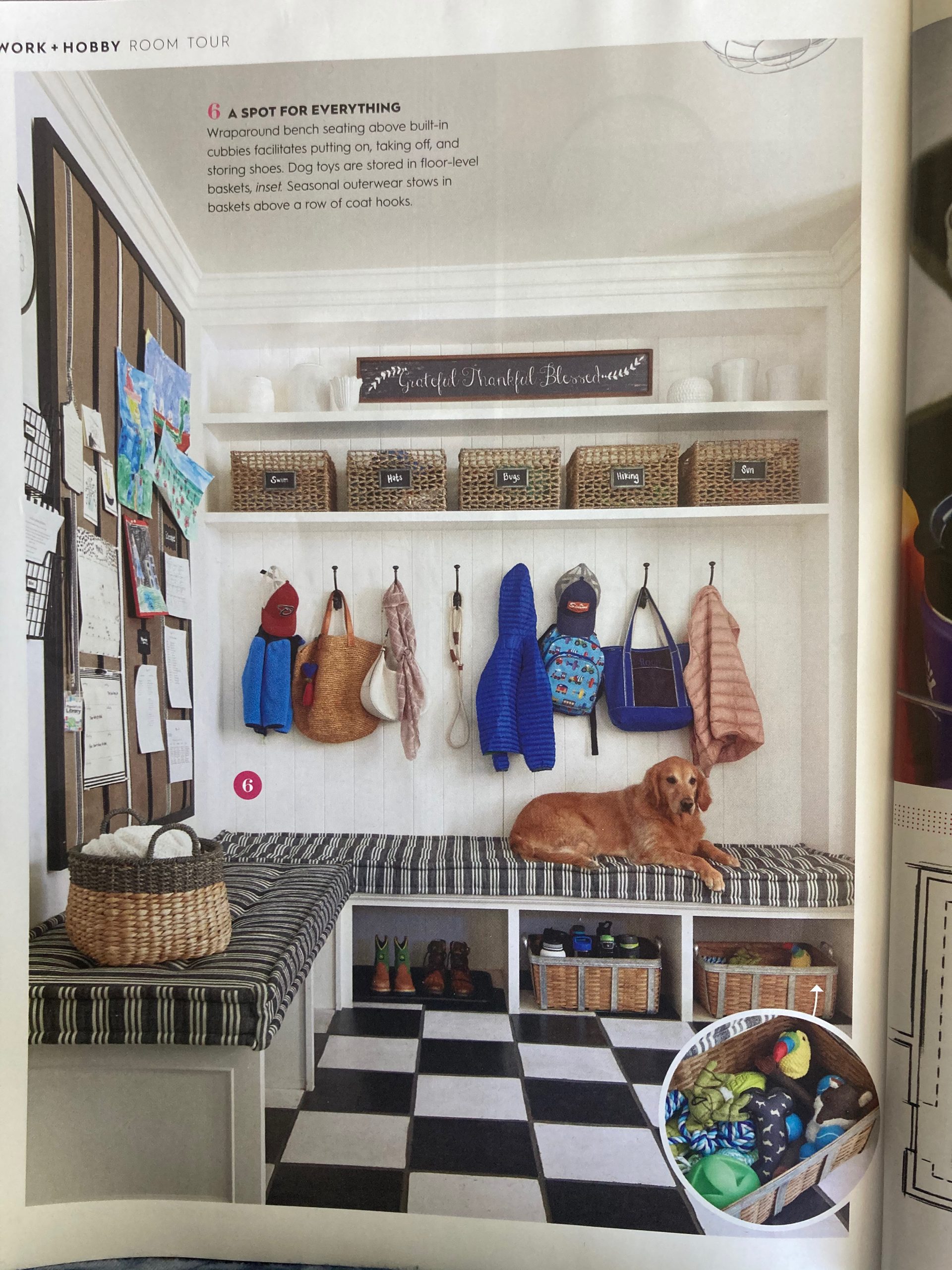
I was drawn to this picture about a families’ mudroom. It is snapshot into family life and a glimpse into helping a family get organized. The photo was published in; Better Homes & Gardens, Secrets of Getting Organized; published; Early Spring 2020.

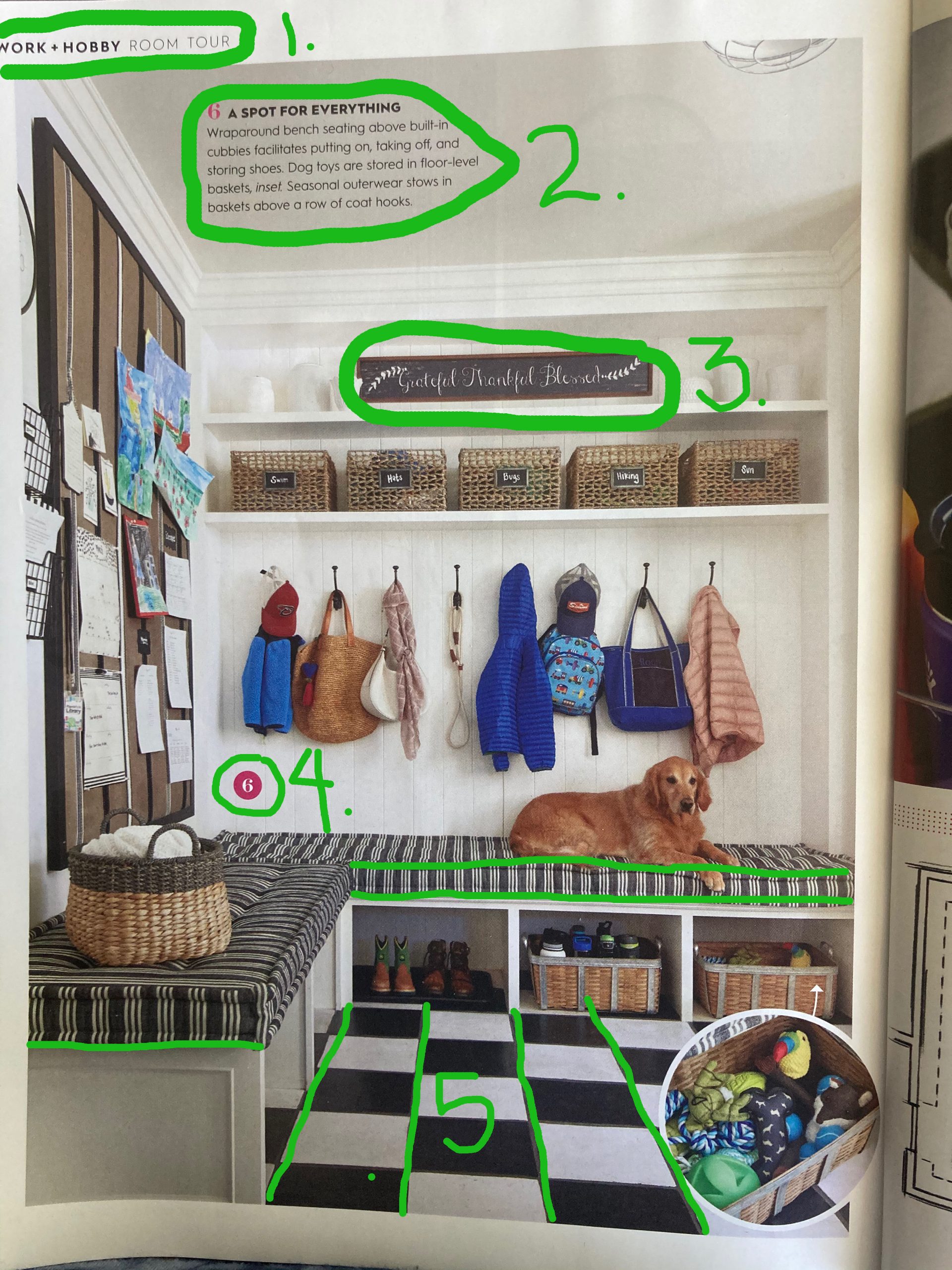
The article used six different styles of typography. Color and thick or thin lines added to the variety to the photograph.

1-Two separate styles were used to label the page and it’s information. One is very thick and next to it a very thin style was used.

2- Uses Color to point out a number to label the area that they are referring to.

3. Is a hand painted sign to add interest and beauty to the very functional room.

4. The bold number in color that referred to the number in #2.

5.This not typography, but a linear pattern that brings the focus of the eye to the center of the grid with leading lines. The pattern of the cushion is also leading lines to the only family member present.

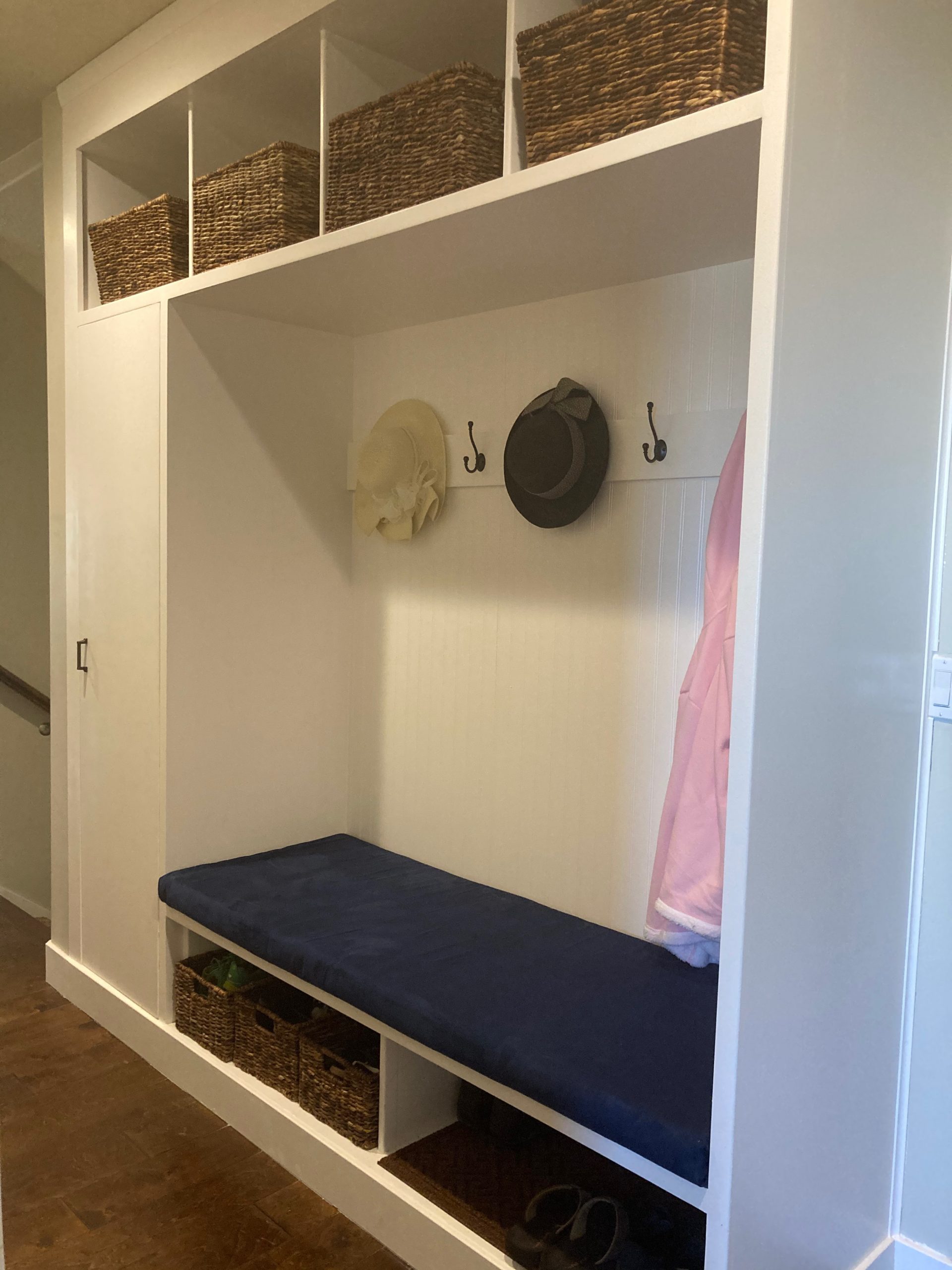
My son Kyle, and my husband Randy, made a beautiful hall organizer this summer.

This is our version of the mudroom solution. Wainscoting gives directional lines. Each cubby, has its baskets containing shoes and other essential winter items. As the earlier photo shows there is a spot for everything.

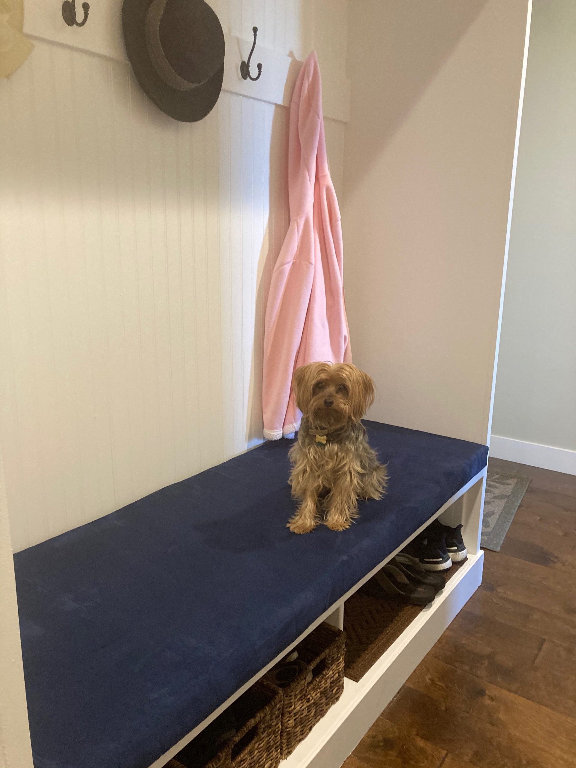
We had to take a cue from our BH&G article photo, and give our version of our new coat room. Our favorite little family representative, “Oliver,” completed the like photo.

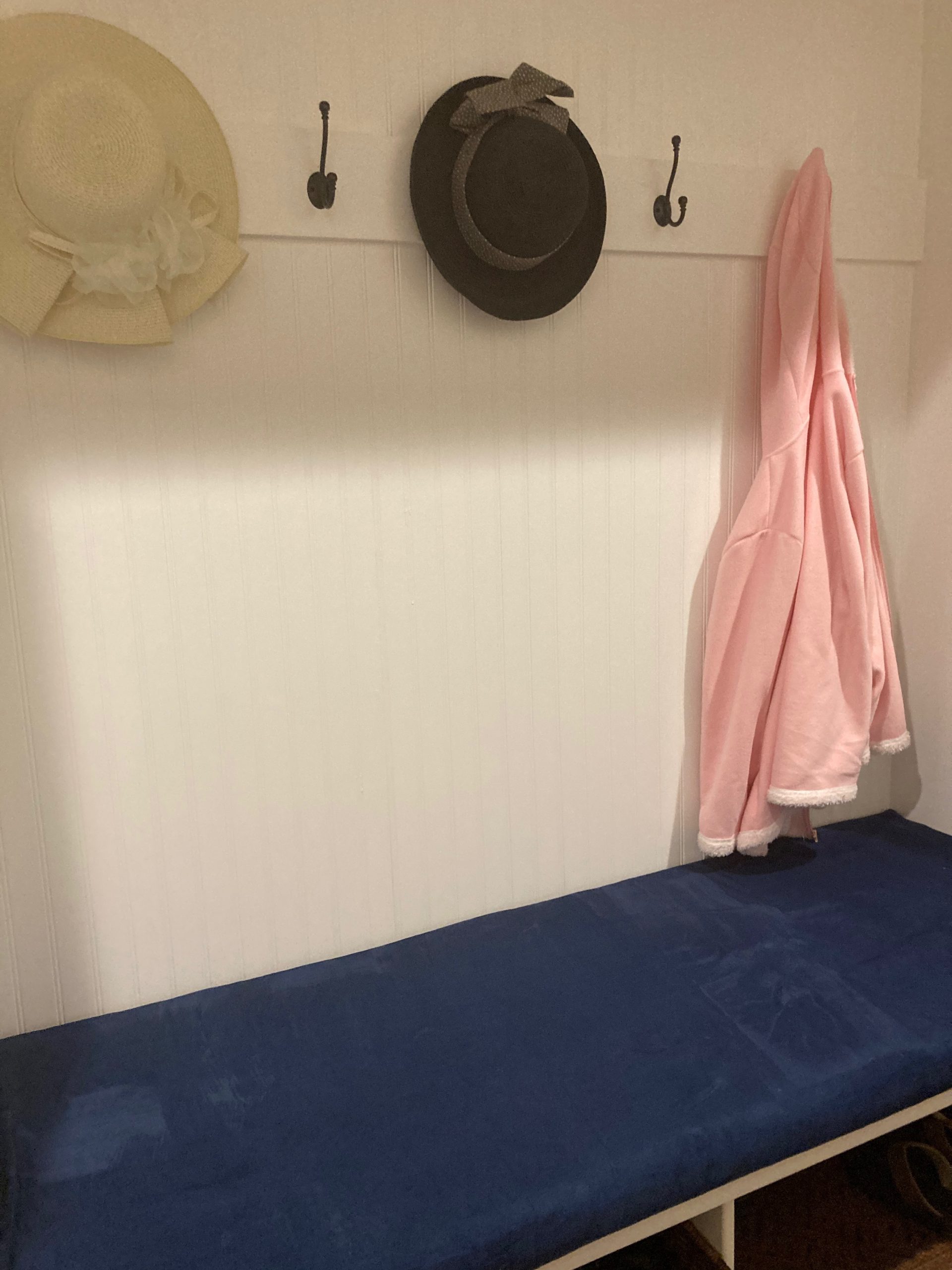
My cushion is not as professional but in velvet so very comfy. It is a great solution to our home.

BYUI Comm130 W02 KellyParies

Art by @clairicegifford Clairice is an illustrator living in Salt Lake City, Utah. She specializes in old-timey pattern, illustration and lettering and everything she creates feels like a glorious fairytale.

Clairice is truly a pattern and color wizard. She masterfully combines elements from the natural world with clean, geometric layout and lettering to produce a polished and inviting design. She also dabbles in laser cut and hand-painted jewelry and ornaments, and I can’t wait to see what she comes up with next.

I love colorful illustrations. This illustration is too loud in the principle of “Contrast.” Contrast has two purposes, to create an interest on that page, and to aid in the organization of the information. Contrast is suppose to pull the eye in. Our eyes like contrast, but I see a problem that I would change in this particular illustration. When adding contrast in this illustration I would choose a different color than white. It does pull the eye in, but it is too harsh. Maybe a light blue would be better for this illustration or even a cream to match the colors already present.

This next selection is on “Repetition.”Repetition is important to show the various elements and how they relate to each other. I really like the colors the artist has chosen in the area enclosed in the bright green circles. “Repetitive elements establish a sophisticated continuity and can pull together the entire piece.” (pg. 61,The Non-Designer’s Design Book)

Alignment. I feel that alignment in this piece is very evident in the blue stems of the flowers that underline the words. “The principle of Alignment tells the reader (or viewer) That even though these items are not close, they belong to the same piece.” (pg. 33, The non-Designer’s Design Book)

Finally, I love the colors that the artist used. Color is one of the most visually interesting elements of a piece. We are drawn to vivid colors. We like others better than some others. I like this selection of colors. I am a colorist and I would not think to use these particular colors. I just think the first word in white does not add harmony to the piece.