

Art by @clairicegifford Clairice is an illustrator living in Salt Lake City, Utah. She specializes in old-timey pattern, illustration and lettering and everything she creates feels like a glorious fairytale.
Clairice is truly a pattern and color wizard. She masterfully combines elements from the natural world with clean, geometric layout and lettering to produce a polished and inviting design. She also dabbles in laser cut and hand-painted jewelry and ornaments, and I can’t wait to see what she comes up with next.
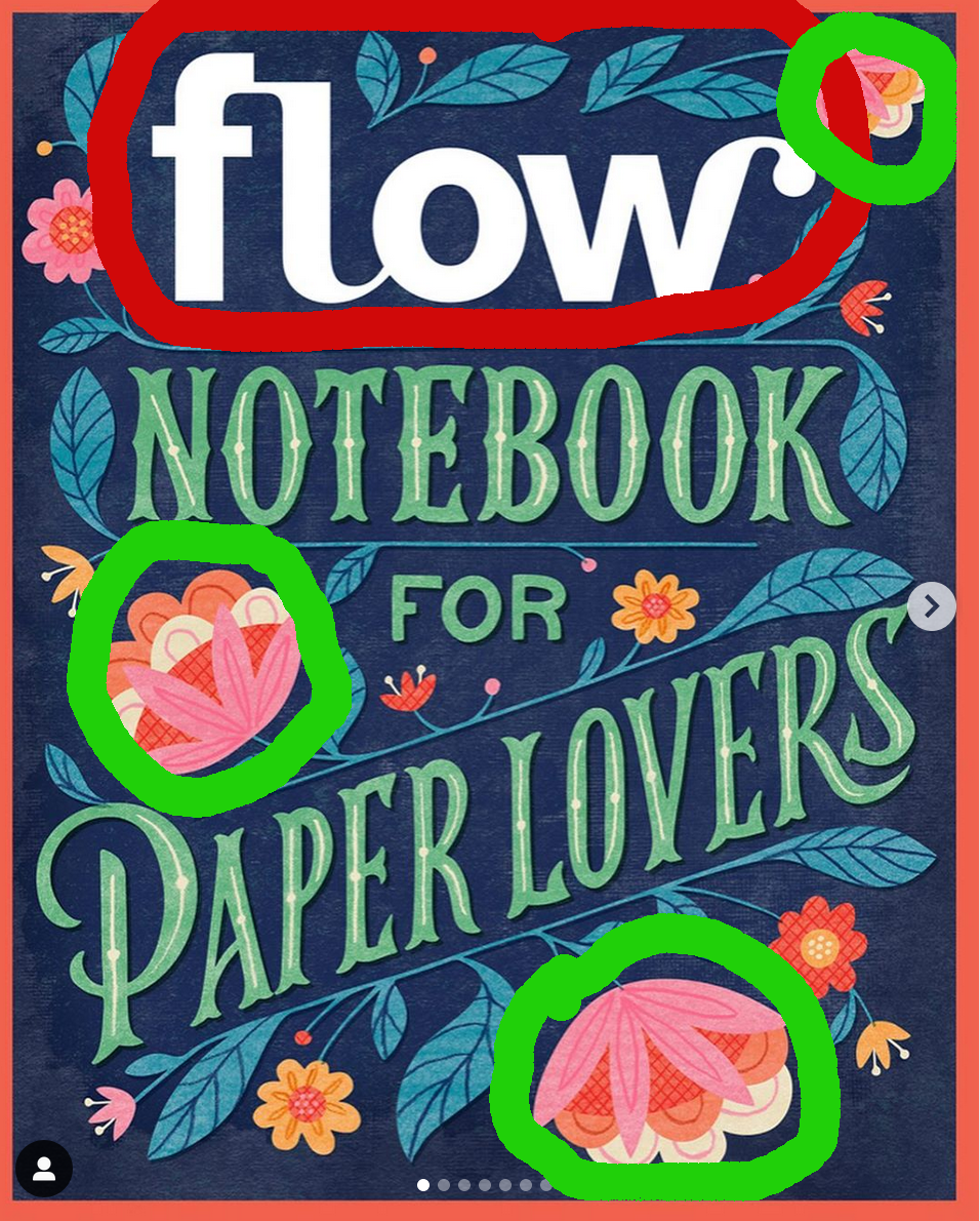
I love colorful illustrations. This illustration is too loud in the principle of “Contrast.” Contrast has two purposes, to create an interest on that page, and to aid in the organization of the information. Contrast is suppose to pull the eye in. Our eyes like contrast, but I see a problem that I would change in this particular illustration. When adding contrast in this illustration I would choose a different color than white. It does pull the eye in, but it is too harsh. Maybe a light blue would be better for this illustration or even a cream to match the colors already present.

This next selection is on “Repetition.”Repetition is important to show the various elements and how they relate to each other. I really like the colors the artist has chosen in the area enclosed in the bright green circles. “Repetitive elements establish a sophisticated continuity and can pull together the entire piece.” (pg. 61,The Non-Designer’s Design Book)
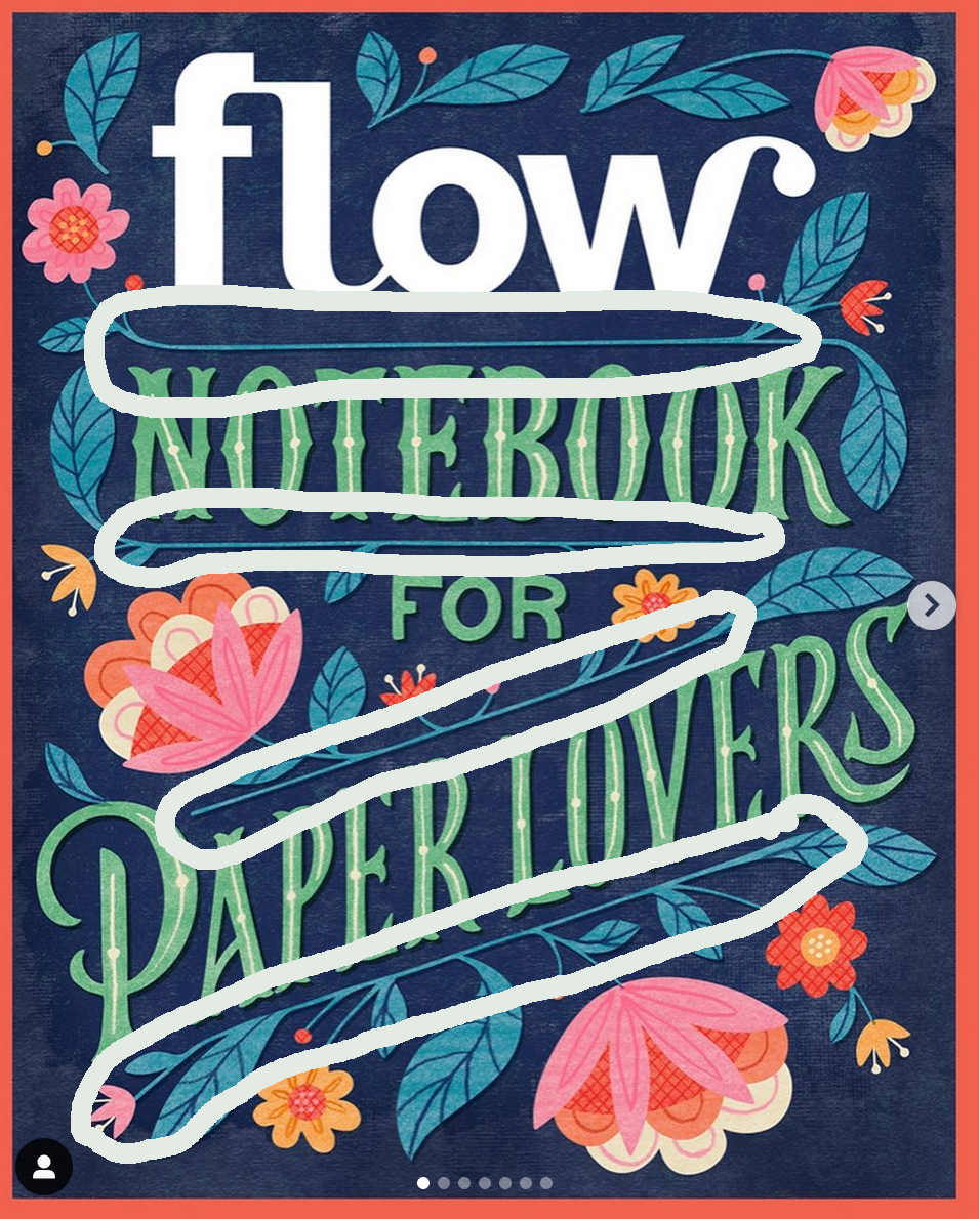
Alignment. I feel that alignment in this piece is very evident in the blue stems of the flowers that underline the words. “The principle of Alignment tells the reader (or viewer) That even though these items are not close, they belong to the same piece.” (pg. 33, The non-Designer’s Design Book)
Finally, I love the colors that the artist used. Color is one of the most visually interesting elements of a piece. We are drawn to vivid colors. We like others better than some others. I like this selection of colors. I am a colorist and I would not think to use these particular colors. I just think the first word in white does not add harmony to the piece.