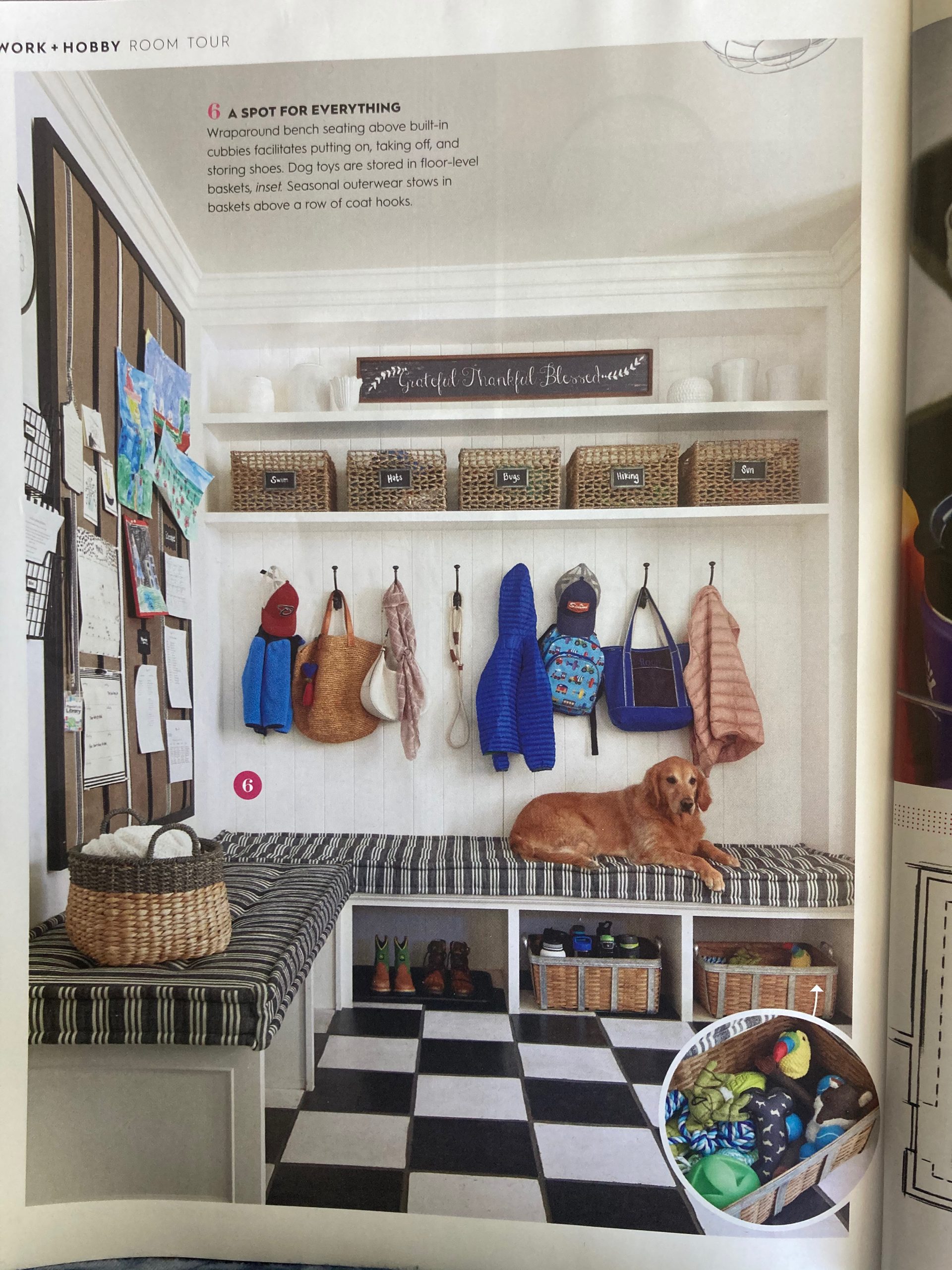
I was drawn to this picture about a families’ mudroom. It is snapshot into family life and a glimpse into helping a family get organized. The photo was published in; Better Homes & Gardens, Secrets of Getting Organized; published; Early Spring 2020.
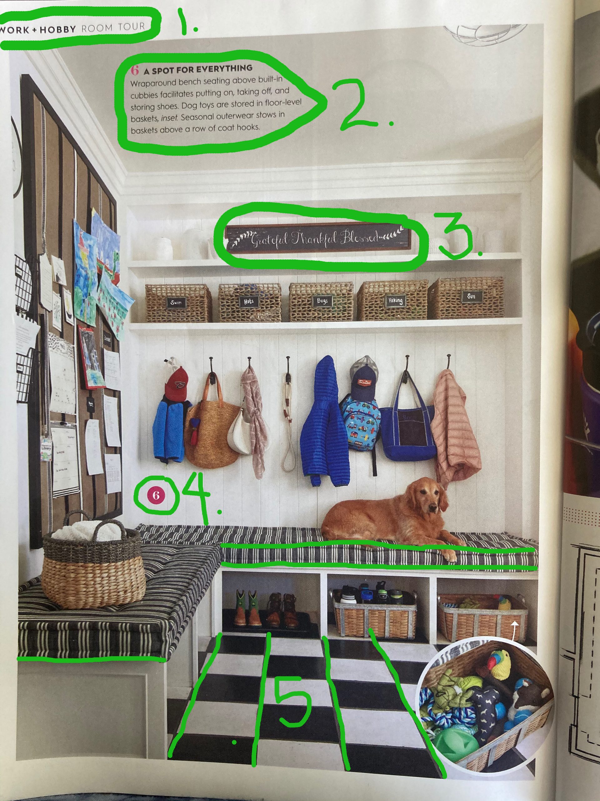
The article used six different styles of typography. Color and thick or thin lines added to the variety to the photograph.
1-Two separate styles were used to label the page and it’s information. One is very thick and next to it a very thin style was used.
2- Uses Color to point out a number to label the area that they are referring to.
3. Is a hand painted sign to add interest and beauty to the very functional room.
4. The bold number in color that referred to the number in #2.
5.This not typography, but a linear pattern that brings the focus of the eye to the center of the grid with leading lines. The pattern of the cushion is also leading lines to the only family member present.
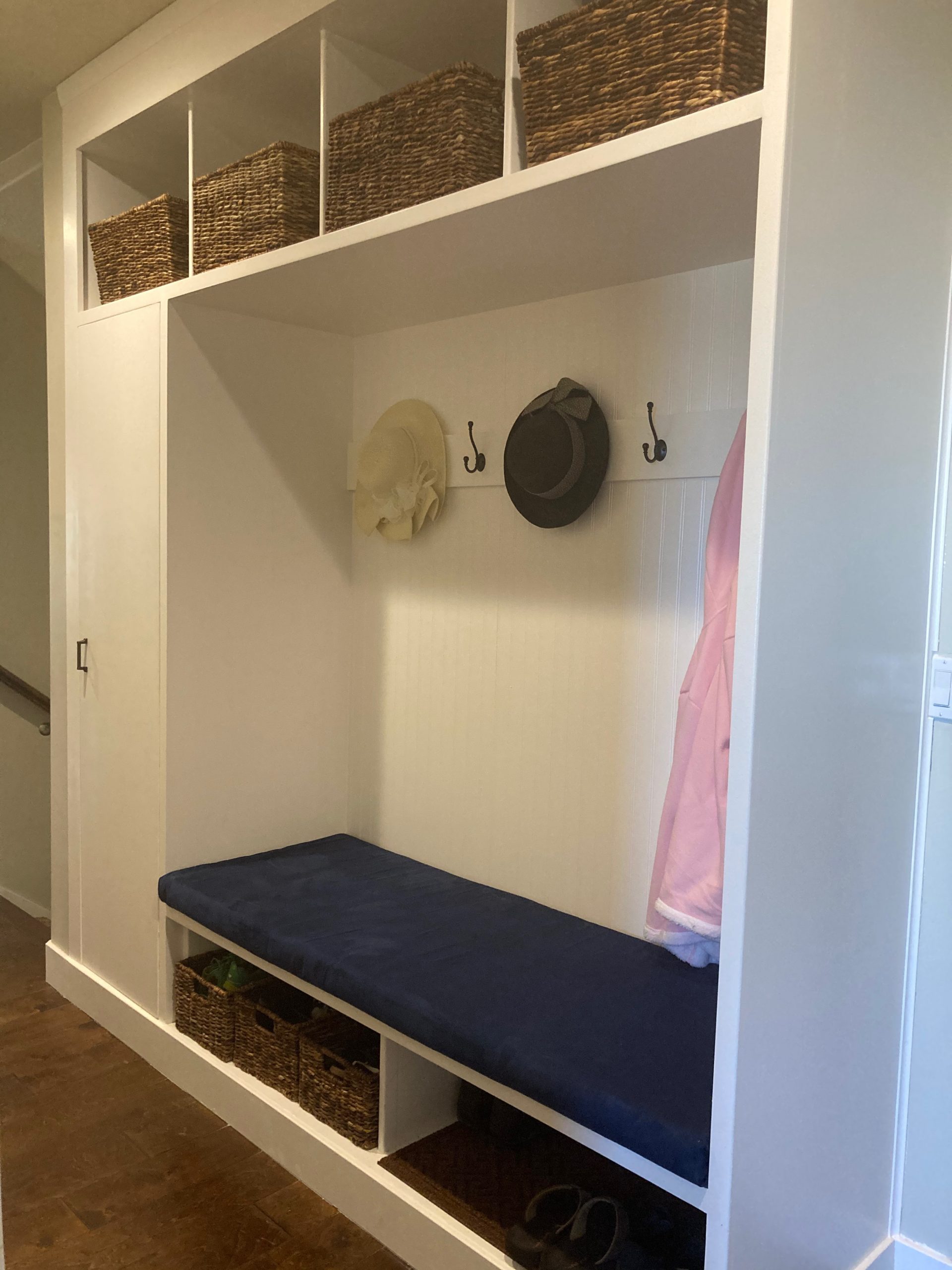
My son Kyle, and my husband Randy, made a beautiful hall organizer this summer.
This is our version of the mudroom solution. Wainscoting gives directional lines. Each cubby, has its baskets containing shoes and other essential winter items. As the earlier photo shows there is a spot for everything.
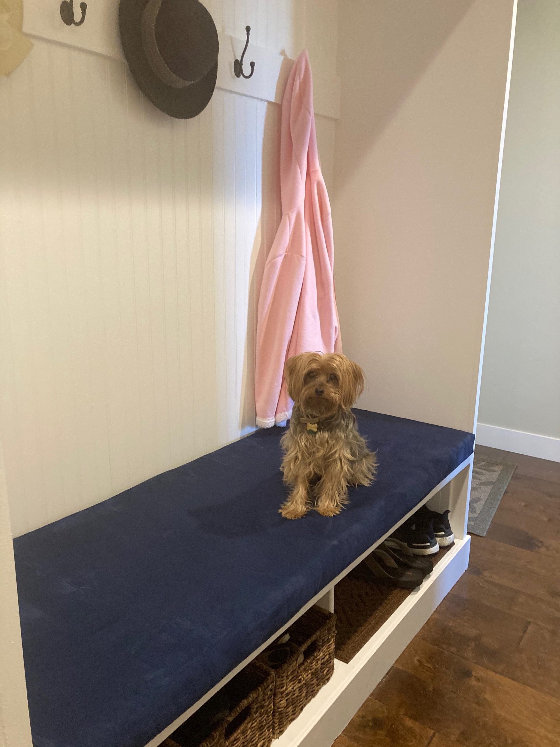
We had to take a cue from our BH&G article photo, and give our version of our new coat room. Our favorite little family representative, “Oliver,” completed the like photo.
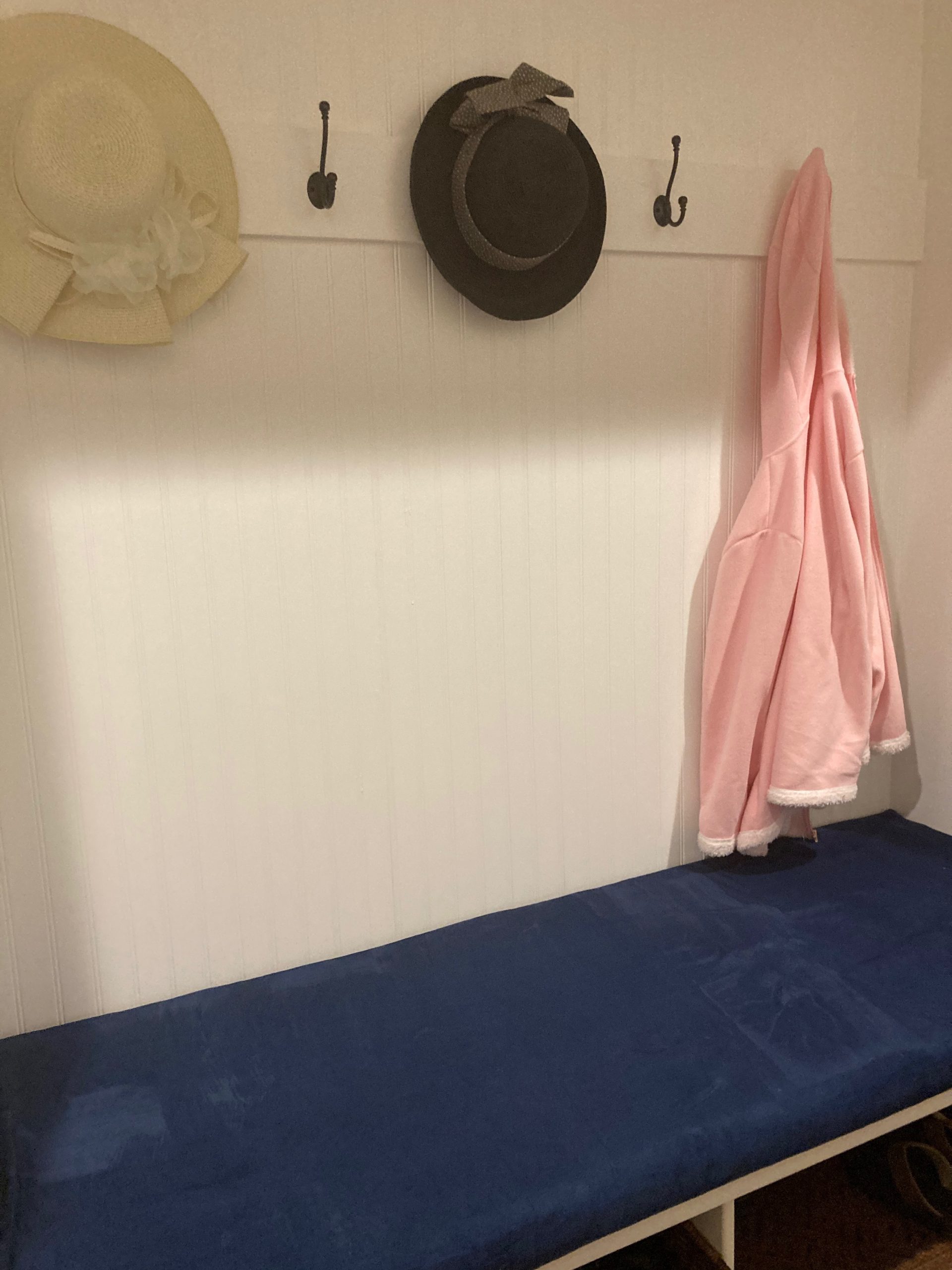
My cushion is not as professional but in velvet so very comfy. It is a great solution to our home.
